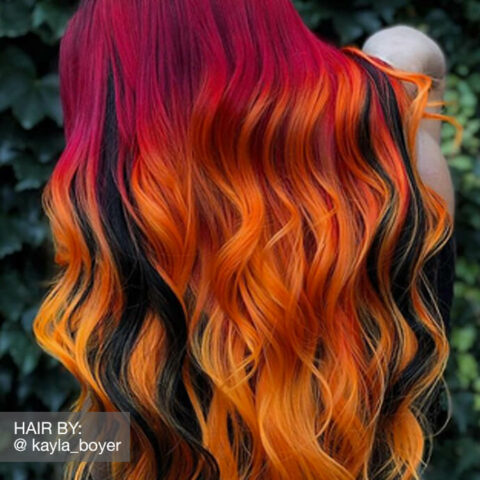

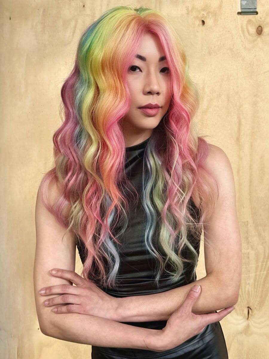
PRAVANA Creative Artist George Blanco brought the house down with this custom pastel VIVIDS rainbow, that reflects Pride and color mastery with his soft-spectrum interpretation of the classic prism proving pastels can steal the show. (All VIVIDS applied over Level 10 Platinum. Pink: Clear-Pastel + Magenta + Crush / Peach: Juicy / Yellow: Juicy + Neon Yellow + Clear-Pastel / Aqua: Clear-Pastel + Aquamarine + Juicy / Purple: Clear-Pastel + Aquamarine + Magenta + Juicy.)
The Trend
PRAVANA ChromaSilk VIVIDS custom pastels are having a major moment. This summer, clients aren’t chasing the boldest shades in the room. Instead, they’re gravitating toward color that feels lighter, softer, and a little more spontaneous. Think dreamy peaches, airy lavenders, cotton-candy pinks, and pastel rainbows that feel just as at home at a music festival as they do at brunch on a rooftop patio.
The overall mood is simple: color should be fun. During the summer, clients want something expressive, but only for a couple of care-free months. That’s exactly why pastel VIVIDS keep showing up in inspiration photos, consultations, and appointment requests. They’re playful, customizable, and easy to switch up.
PRAVANA has been part of the VIVIDS conversation from the beginning. When the brand launched a complete hair color line in 2004, including a selection of VIVIDS shades, it helped open the door to a new era of creative color. More than two decades later, VIVIDS are still going strong. This season is all about softer tones with just as much personality.
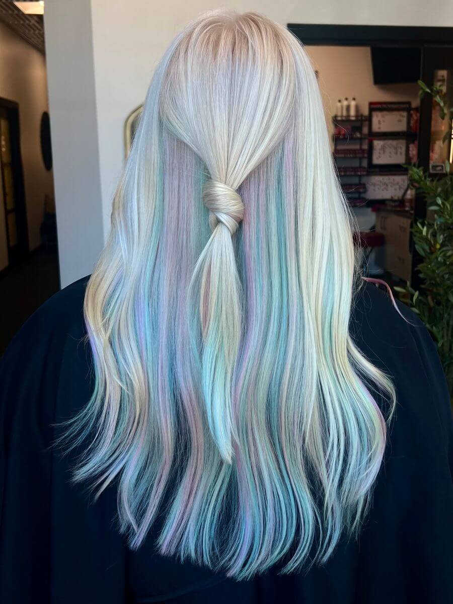
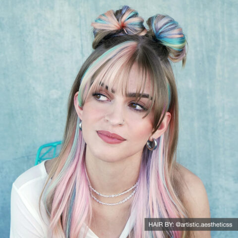
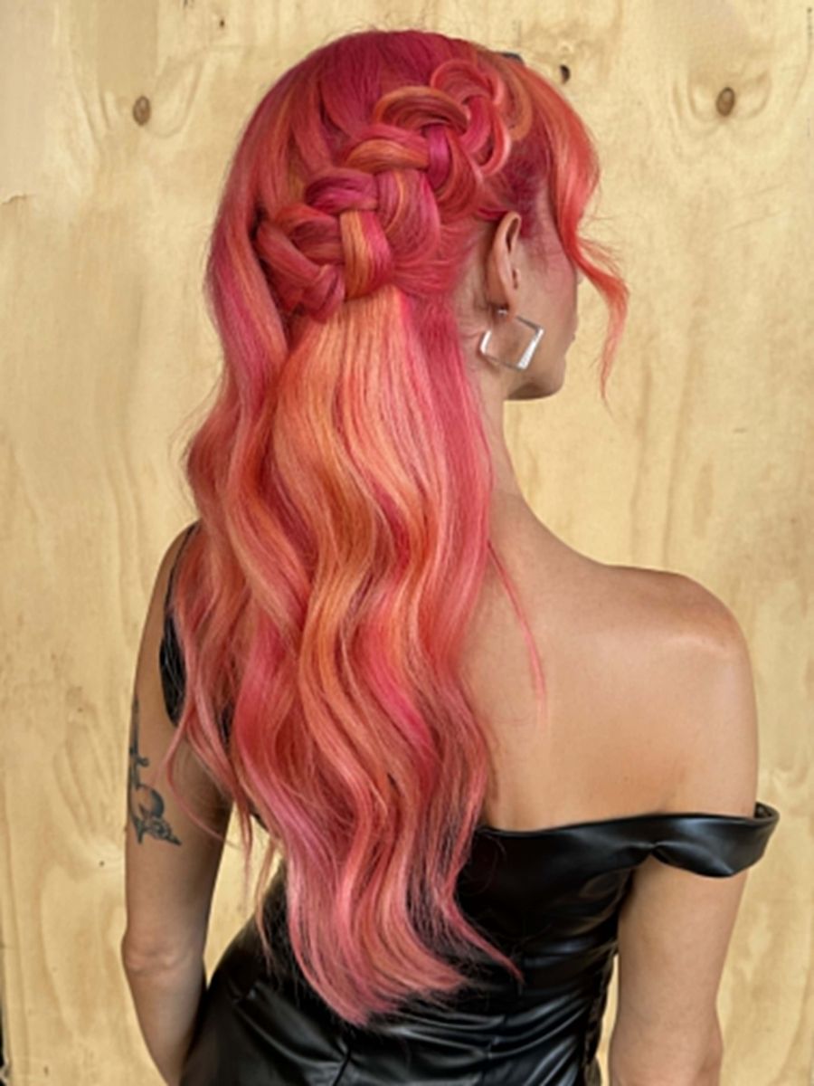
PRAVANA Brand Educator Paige Agster takes a scoop from childhood nostalgia, layering pastel VIVIDS shades into a playful color story reminiscent of those brightly colored beads of ice cream. (Pravana ChromaSilk VIVIDS Pastels Pretty In Pink, Blissful Blue, Luscious Lavender and a custom shade of Clear-Pastel + Emerald applied over Level 10 platinum.)
Why Are Pastel VIVIDS Everywhere Right Now?
Summer naturally shifts the energy behind the chair. Clients move away from deeper tones and lean into brighter wardrobes, lighter makeup, and hair color that feels more relaxed. Pastel VIVIDS fit easily into that shift. They’re expressive without being overwhelming and creative without feeling too serious. That balance is a big part of the appeal.
Some clients are ready to go all in with a full pastel rainbow, while others want something more subtle—small pops of color, blended accents, or soft dimension layered into a brighter VIVIDS look. Flexibility is what makes the trend so wearable.
The fade is another factor. These softer shades fade faster because they are less pigmented and more evenly back to blonde than highly saturated colors. For clients who want to experiment without a long-term commitment, that’s a major plus.
How Can You Make Pastel VIVIDS Shades Feel Personalized?
The best VIVIDS work never feels copied from a photo. Clients respond to services that feel personalized, not pre-set. Building custom pastel formulas allows stylists to create something unique for each guest while elevating the overall experience.
A full pastel rainbow can still feel soft and wearable, while ribbons of pastel placed through brighter VIVIDS add movement and dimension. For something more understated, pastel tones can even be worked into traditional color services. Paired with a natural base, pastel VIVIDS create a look that feels fresh, modern, and easy for summer.
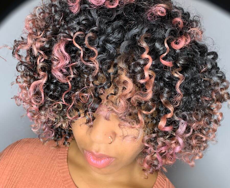
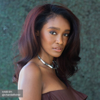
PRAVANA Brand Educator Shawn Harvey shows how strategic pops of pastel pink VIVIDS can transform rich brunette curls, creating contrast so texture and color share the spotlight. (PRAVANA ChromaSilk VIVIDS Pink applied over Level 10 pre-lightening.)
How to Create Custom VIVIDS Pastel Formulas
This is where things get more creative. PRAVANA ChromaSilk VIVIDS Clear-Pastel opens the door for real customization. Create your own shades by starting with 20-30g of Clear-Pastel in a bowl and add more pigmented shades in grams until you see the shade you want testing on a paper towel. Because VIVIDS are direct dyes and pastel shades are applied over Level 10, what you see is what you get.
Whether it’s a soft monochromatic look or a more dimensional pastel blend, customization is what turns inspiration into something that feels intentional.
Pro Tip: Save clippings of hair from cuts to pre-lighten and strand test custom formulas.
How to Create the Perfect Canvas for Pastel VIVIDS
Pastel color shows everything underneath, so prep matters.
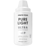
1. Start by lifting to a clean level 10 using PRAVANA Pure Light Ultra Lightener for platinum blonding. Pastel shades look best on a canvas that’s bright, consistent, and free of warmth. Anything left behind can shift the tone and affect how the color fades.
2. Once you’ve reached the right level, tone to set the tone. PRAVANA ChromaSilk Express Tones or ChromaSilk Platinum Toner can be used to set the tone in as little as 5 minutes. For example, tone with Platinum Toner Blush for pink shades, tone with Express Tones Clear + Violet to eliminate any warmth to create a clean base for cool shades.
The better the prep, the better the result.
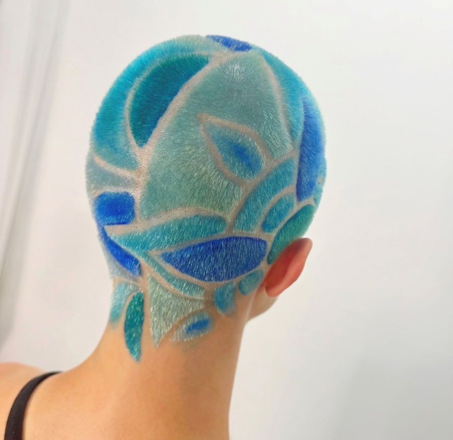
PRAVANA Brand Educator Nonnie Berard dives deep into creative color, using shades of blue VIVIDS transforming a geometric hair tattoo into an ocean-inspired statement piece giving us island vibes. (Toner: Express Tones Smokey Silver & Violet followed up with a PRAVANA ChromaSilk VIVIDS application: Blue Topaz, Aquamarine, Neon Blue, Blissful Blue and a custom shade of Clear-Pastel + Emerald applied over Level 10 platinum.)
VIVIDS Application Process
Now that you have created the perfect canvas, it’s time for the perfect application.
1. After toning, shampoo and dry the hair completely. Fully dry hair is key. Any moisture left in the hair can dilute the formula and impact the result.
2. Apply the ChromaSilk VIVIDS pastel formula generously, making sure each section is fully saturated. Let it process for 30 minutes at room temperature, then cleanse, condition, and style.
Since VIVIDS is a semi-permanent direct dye, there’s no need for developer, which keeps the process straightforward.
Pro Tips for Better VIVIDS Results
Pro Tip #1: Pay Attention to Saturation
Work in clean, ½-inch sections and apply color generously with a brush. Use both vertical and horizontal movements while working through the hair to ensure even coverage. Reload your brush about every three inches. Stretching product too far can lead to uneven or dull results.
Pro Tip #2: Talk Through Maintenance
Clients love creative color but don’t always realize how much maintenance impacts longevity. Encourage less frequent washing and suggest dry shampoo between washes. Cold water helps preserve color, while frequent heat styling can cause it to fade faster. Chlorine, salt water, and hot tubs will also speed up color loss, so it’s worth setting expectations early.
Pro Tip #3: Recommend the Right Shampoo
Not all shampoos are color friendly. Look for formulas without harsh sulfates like SLS and SLES (sodium lauryl sulfate and sodium laureth sulfate). The PRAVANA Care Collection offers options designed to help maintain color while supporting different hair types. What clients use at home makes a noticeable difference in how long VIVIDS last.
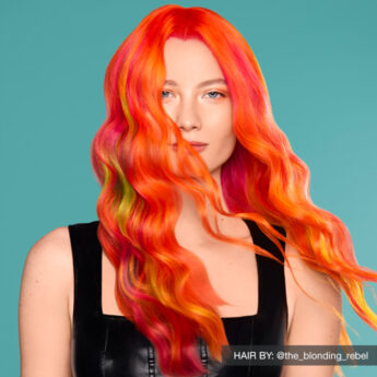
PRAVANA Creative Artist George Blanco turns up the heat with a VIVID blend of coral, pink and pastel peach accents, showcasing the bright, playful potential of ChromaSilk VIVIDS Juicy and Crush. (PRAVANA ChromaSilk VIVIDS Sunstone / Juicy / Crush + Clear-Pastel + Magenta / Juicy + Sunstone + Crush applied over Level 10 pre-lightening.)
Pastels Beyond VIVIDS
VIVIDS aren’t the only path to softer color. Similar pastel tones can be created using PRAVANA ChromaSilk VIVIDS Everlasting permanent color by mixing any shade with a Level 10 ChromaSilk Creme Hair Color in a 1:3 ratio, or by using PRAVANA ChromaSilk HydraGloss demi-permanent color utilizing a majority of Clear paired with a small amount of a target shade which varies depending on intensity.
Strand tests are your best friend.
Having multiple options gives stylists more flexibility and makes it easier to tailor the service to each client’s desired result.

PRAVANA Senior Artistic Educator Becky Betts brings editorial vision to everyday wearability, melting a smokey drag root into a luminous peachy balayage created with PRAVANA HydraGloss demi-permanent color. (Base: HydraGloss 10S + 5S / Mids-Ends: Alternating 1″ sections of HydraGloss Clear with a dot of 7C and HydraGloss Clear with a tiny dot of 5R over Level 9/10 balayage.)
The Pastel Playbook, Summed Up
Pastel shades created with PRAVANA ChromaSilk VIVIDS are bringing a softer approach to creative color for Summer 2026. They’re customizable, have lower commitment, and versatile enough to work as a full transformation or a subtle seasonal shift. From soft lavender tones to icy mint and barely-there blush, they give clients room to experiment without going too far outside their comfort zone.
For stylists, the foundation matters. A clean level 10 lift and toning to set the tone lead to more even results and better fade-out. Pair that with solid home care recommendations, and clients can keep their color looking fresh well beyond the appointment.
The best summer color isn’t always the loudest color in the room. It’s the one you can’t stop looking at.
Professional Brand System: PRAVANA ChromaSilk VIVIDS
Color Formulation Category: Semi-Permanent Direct Dye Hair Color
Mixing Ratio: No developer required.
Processing Time: 30 minutes at room temperature.